Collaborative works by:
Michael Brown, Sean Carroll, James Duff, Lindsay Johnson
Introduction
In the final months of and in the years after World War Two, many resources, documents and records relating to Royal Navy camouflage were purposely destroyed. That there might have been future value in these resources was either not recognized or deemed unimportant. In the decades in between then and now, several researchers have attempted to piece together from old samples, eye witness accounts and photographic records, a view on what the Royal Navy’s colour palette was during the years 1939 to 1945. The authors’ motivation for writing this work stems from trying to reconcile contradictions in extant references and various anachronisms evident both in other published works and common belief as compared to formal documentation.
This work deals with the shades 507A, 507B and 507C, before moving on to the shades G10 and G45 which emerged in the 1943 series of Royal Navy camouflage colours.
All colour measurements made in the preparation of this paper were carried out using a Nix Pro Color Sensor; a hand held digital device with its own calibrated light source and which is operated using a smart phone application. This made it possible to take digital readings of extant samples in controlled environments where it was not possible to bring the samples to desk-top spectrophotometers. The author’s Nix sensor has been checked against published standard colours as well as spot checked against Sovereign Hobbies Colourcoats factory’s desk mounted spectrophotometer.
The authors trust that the methods, discussion and references made herein will be found to be a robust argument by the reader, and that based upon this writing the reader will be better equipped to both recognize 507A, 507B, 507C, G10 and G45 by time period, their common uses with other shades comprising typical Admiralty schemes and understand the nature of these colours.
The authors would like to extend thanks to the staff of The National Archives at Kew in London, along with Heather Johnson, Curator (Archives) of the National Museum of the Royal Navy, Portsmouth, and also a special thanks to Richard Dennis who provided a wealth of documentation directly relevant to this paper. This research would not have been possible without the accommodation and willingness of all these sources of primary source references.
Pattern 507 series
History and formulations
The first known reference to a Pattern 507 grey paint is in 1902. This was a dark neutral grey comprising only black and white pigments.
Sometime before WW1 a darker-still Pattern 507A was introduced, then a 507B as a distinct (lighter) shade in 1915 and a lighter-still 507C in 1916. The neutral-hued 507B & C continue until 1926, but at some unknown time after 1919 and before 1931 (probably 1926 also) both the original Pattern 507 and 507A greys were discontinued.
507C was the first to gain Egyptian Blue pigment in 1926, with 507B gaining blue pigment the following year.
In order to achieve uniformity of painting of ships a 1933 Admiralty Fleet Order (AFO) 1776 (NS1221/33) (27/07/33) introduced blue/black pastes in place of separate blue and black ingredients.
“Grey Paint, Home Fleet Shade, Pattern 507B”, was given the formula:
- Pattern 409 White Lead 21lbs
- Pattern 704 Zinc White 56lbs
- Pattern 689 Marine Dryers 3,1/2lbs
- Linseed Oil Raw 12 pints
- Linseed Oil Boiled 8 pints
- Turpentine Sub 2 pints (1 part spirit of turpentine to 3 parts white spirit)
- Pattern 370 Blue Black Paste (1 tin) 7lbs
- 1 gallon Dark Grey Enamel Patt 11 of similar shade to be added to each 100wt. Add turpentine sub to tin of Blue/Black to ensure full removal.
There were adjustments made to the blue-black pastes in changing from Egyptian to Ultramarine Blue through the mid 1930s, with revised formulae given to maintain the intended shade.
By 1936 we see the 1939/early war formulations arrived at, as published in AFO 2680/36 (NS 3501/36) (05/11/36).
The two grey shades in use were described and specified in that document as:
Dark grey paint, Pattern 507B
- Pattern 409 White Lead 21lbs
- Pattern 104 Zinc oxide 56lbs
- Pattern 689 Paste Driers 3.5lbs
- Oil, linseed, raw 12pts
- Oil, linseed, boiled 8pts
- Turpentine substitute 2pts
- Pattern 370A Blue-black paste 7lbs
- Ten pints of dark grey enamel, Pattern 11, to be added to each cwt of paint
Light grey paint, Pattern 507C
- Pattern 409 White Lead 28lbs
- Pattern 104 Zinc oxide 50lbs
- Pattern 689 Paste Driers 5lbs
- Oil, linseed, raw 20pts
- Pattern 371 Blue-black paste 7lbs
- Six pints of light grey enamel, Pattern 12, to be added to each cwt of paint
In January 1939, a Pattern 507A grey paint was introduced but, as the AFO makes clear, it was the same shade as 507B. It is important for context to understand at this point at two enamel paints were also available and documented at this time, given the identifiers Pattern 11 for the Dark Grey to Home Fleet shade and Pattern 12 for Light Grey.
AFO 211. Mixed Paints (N.S./D.A. 1106/38-19.1.1939.) states the following:
Mixed Paints
Dark grey paint, Home Fleet shade, for other than weather work, is being added to the Authorised List as Pattern 507a. The formula is the same as Pattern 507B except that the enamel is omitted.
- The description of Pattern 507B has been amplified to read:- “Paint mixed, dark grey, Home Fleet shade, for weather work”.
We see in this important AFO that Pattern 507A and 507B are both Home Fleet shade and featured identical pigmentation, only including or excluding the enamel paint and intended for different parts of the ship.
On the 17th of October 1940 AFO 3935.- Economy of Paint during the War (D. 12427/40.-17.10.1940.) was published giving the following orders to the fleet (orders (i) and (ii) omitted by the authors as non-relevant to paint discussion):
During hostilities it has been decided that considerable economies are to be effected in the painting of H.M. ships and auxiliaries. The following instructions are, therefore, promulgated for information and guidance:- (iii) Finishing Coats:- The use of enamel is to be entirely suspended for the duration of the war in all ships, when stocks in the dockyards have been used up. For internal work … . For external work two coats are to be applied. For parts visible from outside the ship, the finishing coats are to be matt paint. (iv) Varnish.- The use of varnish on spars is to be discontinued, wood spars generally are to be painted. (v) Decks.- Bare steel weather decks visible from the air are to be painted with two coats of red oxide of iron followed by two coats of non-slip grey paint. Bare steel decks below …
Effectively this would have suspended 507B shortly thereafter and this was confirmed in AFO 4074 Economy in the Use of Zinc Oxides (D.8136/41 – 18. 9.1941) which explicitly discontinued the use of 507B during the period of hostilities.
Fundamental premises
In general, there have been claimed original paint samples held by various researchers over the years which have been identified by them as 507A, 507B and 507C respectively. The authors are unsure as to exactly where or when the widely held belief that 1930s and 1940s 507A and 507B were “Dark Grey” and “Medium Grey” shades respectively originated, but it seems to be a belief which gathered followers in the 1970s and has been consolidated and repeated since. We have found no evidence in primary source references to support this idea, and plenty of primary source references which directly contradict it. Based on the available references used in compiling this work, the authors believe that the early WW2 era patterns 507A and 507B were the same colour, known to the Admiralty as “Dark Grey, Home Fleet shade”. The only difference was the surface finish of the two, with 507B containing a proportion of enamel paint as described earlier making it somewhat glossier than 507A.
The widely held, yet problematic, modern understanding of the pattern 507 family is as follows, with Light Reflectance Value (LRV) of these shades noted below each, measured from Snyder & Short Enterprises’ cards using a Nix Pro Color Sensor hand held spectrophotometer using current industry standard D65 illuminant and 1964 10⁰ observer:

Light Reflectance Value is a measure of the total quantity of visible light reflected by the surface, or in layman’s terms, how bright or dark it appears. A low LRV gives a dark appearance and a high LRV gives a light and bright appearance. The following two blocks have the same saturation of red and blue, but on the left we have a low LRV and on the right a high LRV:

Saturation of colour is a measure of intensity of particular colours of visible light. Pure white and pure black are completely unsaturated, whereas a brilliant colour is highly saturated. The following two blocks have the same lightness, but on the left we have an unsaturated colour and on the right a highly saturated colour, but both are blues with no red or yellow content:

The 507 family of paints in the mid 1930s to 1940s are all low saturation blues, not neutral greys.
The National Archives at Kew, London, hold a number of original documents in a strictly controlled fashion. This assures the integrity of the document and in this case, the authenticity of the paint samples.
Amongst the documents reviewed, ADM212/124 Standardisation of Admiralty camouflage colours dated to 1942 contained genuine 507A and 507C samples. These samples were in the form of painted chips adhered to annotated leaves of thin paper. It is considered highly unlikely that this document has been tampered with given the control exerted by the National Archives on this record and the fragility of the backing paper.
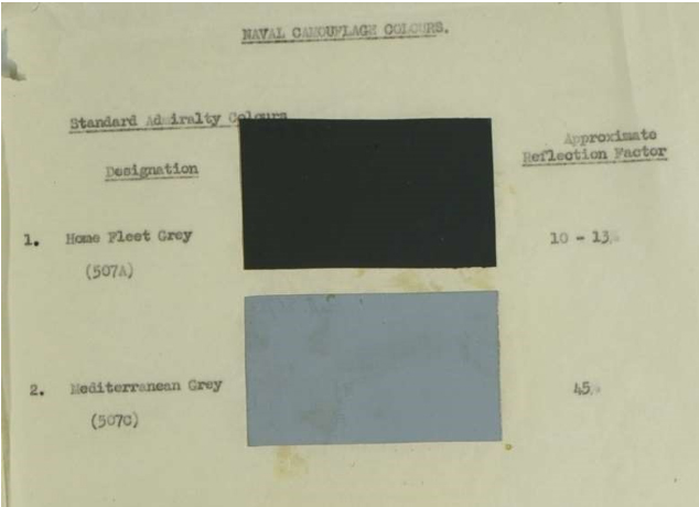
(Image of colour chips presented in ADM212/124 held at The National Archives, Kew)
This document compared reasonably well physically with Colourcoats RN01 507A Dark Grey, and the Snyder & Short Royal Navy chips 507A sample that Colourcoats was originally based on but was slightly darker. This places the Kew sample, itself 75 years old at time of writing, below the lower end of the stated tolerance of Light Reflectance Value at approximately 7%. The 507C sample was similar in character to the Colourcoats RN03 507C Light Grey and hence Snyder & Short 507C sample, but quite noticeably darker.
507A and B
507A is described in various official documents, along with its Light Reflectance Value (LRV). These values are tabulated as follows:
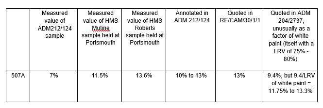
It is noteworthy that ADM 204/2737 stands alone in quoting the LRV of 507A as being a percentage of another paint. The other sources either omit this statement, or expressly state that they are (as is standard practice) measuring paints against theoretically ideal white at 100% LRV.
Whilst values tabulated above clearly seem to be at or around 10%, the following renders illustrate the visual variance noticeable at the extreme ends of the scales, and these are compared with the currently recognised (distinct) shades of 507A and 507B.
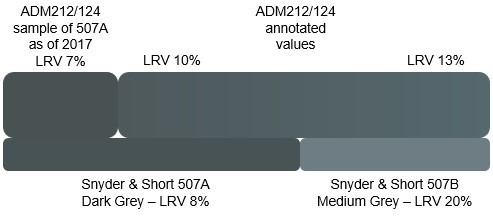
The physical sample of ADM 212/124 may be taken as instructive of the character of 507A; i.e. a dark grey with a bluish caste. This correlates with the pigmentation formulae given earlier comprising white, blue and black content. The sample appears to be slightly darker than intended and the blue appears to be neutralizing and shifting to green, but this would be consistent with aging of linseed oil based paints.
The Snyder & Short 507A sample is slightly darker than the nominal intended value of 507A, whilst the 507B sample is significantly lighter.
In conclusion, the available evidence (and there is more to follow when we examine G10) suggests that the intended LRV of 507A (and therefore of its sister 507B) was 10%, but that up to 13% was evident.
507C
The lineage of 507C is somewhat less confused than that of the 507A and 507B paints. The colour remained essentially constant from the mid-1930s until its use ceased after the second world war. The pre-mixed blueblack paste used to make Pattern 507C Mediterranean Grey, or Light Grey, as it was also known, was different to that used for 507A, but no documents we have been able to obtain (which includes purchasing a copy of the defunct British Standard BS390 referenced in the Admiralty discussions) have ever revealed the exact composition of blue-black pastes, either pattern 370A or pattern 371, the latter of which was the one used in 507C. We can however refer to substitute mixes published by the Admiralty for use by ships unable to procure pre-mixed pattern 371 Blue Black Paste at their location using discreet black and blue pigments to arrive at the same shade. An example of this alternative is given in ADM 1/0002 New Zealand Station Memo NZ648/9778.
Pattern 507C Substitute in lieu of Patt 371 Blue Black paste
- Pattern 409 White Lead 28lbs
- Pattern 104 Zinc oxide 50lbs
- Pattern 689 Paste Driers 5lbs
- Oil, linseed, raw 20 pints
- Pattern 8P Ultramarine Blue 3lbs
- Pattern 110C Black 1.5lbs
From this, we can derive the proportions of blue to black in Pattern 371 Blue Black paste. Scaling down this formula to reproduce 507C has been carried out but requires extreme care. The simple ratio of 78lbs of white pigment to only 1.5lbs of black quite obviously means that when scaled down to sample quantities, the black contingent is both very small and extremely powerful. A very minor error in measuring out a small quantity of black pigment introduces substantial changes in the resultant tone of the paint. The authors did reproduce this paint using artists’ pigments, the stated liquid constituents and a set of precision digital scales, and the results support the extant samples in character of the shade.
The Light Reflectance Value of 507C is described in various official documents including ADM 212/124, RE/CAM 30/1/1 and RE/CAM/N/8 with a value of 45%.
At present, most with an interest in the Royal Navy around this time period will be primarily familiar with Snyder & Short’s 507C sample. This colour is generally considered reasonably accurate and characteristic of 507C insomuch as it is a cool, light bluish grey. It is however somewhat lighter than the documented values at approximately 52% Light Reflectance Value. This does not look out of place on models of ships of the pre-war Mediterranean Fleet in overall 507C which were typically photographed in very bright warm climate sunlight and reflecting a great deal of light. Keeping ships cooler inside in hot climates was indeed the reason ships were painted in 507C rather than 507B when on foreign stations such as the Mediterranean.
A 507C at 52% LRV does however begin to be problematic when used as part of a camouflage scheme and leads to a great deal of confusion when interpreting black and white reference photos. Specifically, the contrast between 507A and 507C in reality was not so great as many currently believe, and furthermore such a light notion of 507C risks confusion with MS4a (LRV 55%). In short, we cannot interpret black and white photographs if our understanding of the tone of paints is incorrect.
The results of darkening 507C to the target 45% value gives the following, illustrated beside both 13% and 10% LRV versions of 507A / 507B:

G10 and G45
The currently understood nature of G10 and G45 is that they are unique shades in the Royal Navy’s World War Two era colour palette. These are rendered below from measurements taken from Snyder & Short Enterprises’ cards as well as measurements from an original set of cards held at the Admiralty Library at Portsmouth using a Nix Pro Color Sensor hand held spectrophotometer using current industry standard D65 illuminant and 1964 10⁰ observer in all cases:

In May 1943 AFO 2106 and CB3098R were issued. In order to overcome confusion in the naming of paints these introduced a simple letter/number system: B for blue-grey and G for grey was followed by a number indicating the RF of the paint:
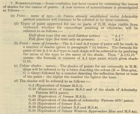
AFO 2106/43 also contains the paint mixing formulae for the entire series. Relevant here are G10 and G45 presented thus:
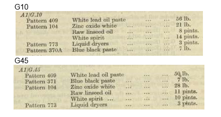
Whilst it is clear that both the G10 and G45 formulae again contain only white and blue-black pigments and thus are both bluish greys, we have found no documented evidence whatsoever suggesting the existence of an alternative shade of G45 with a warm hue, which requires a yellow and/or red component.
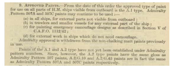
However the key thing about these mixes is that the selection and proportions of pigments are identical to the 1941 onwards mixes for 507A and 507C resulting from AFO 4074/41 which reversed their pre-war quantities of white lead and zinc oxide, so G10 was 507A and G45 was 507C.
AFO 2016/43 tells us explicitly that 507A = G10 and 507C = G45:
The Snyder & Short colours are based upon original samples of the paints obtained by John Snyder & Randy Short. The authors have no reason to believe these have not been replicated faithfully. G10 sample measures slightly darker than specified, with a noted green content and very marginal blue component as compared to a perfectly neutral grey comprised purely of black and white. The G45 sample measures notably darker than specified with a relatively strong yellow content and noted green content. The Portsmouth samples have not darkened so much, but exhibit stronger green and yellow. Overall, the Portsmouth samples would appear to have degraded worse than the samples the Snyder & Short colours were matched to, although all have been affected by time elapsed since they were made.
As we have seen from the formulations above, the ingredients used to produce both comprised linseed oil which darkens and yellows with age, lead white (which darkens and yellows with age), zinc white, ultramarine blue and black. Even if we assume that Section 9’s wording in AFO2106/43 was careless, it is clear that a combination of white, ultramarine blue and black pigments cannot make yellowish or greenish shades of grey. It is also widely known both in the paint industry and in the art world that both linseed oil and lead white are susceptible to both darkening and yellowing with age.
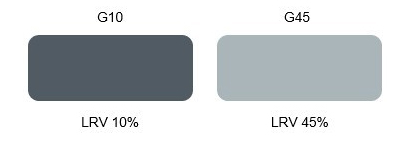
In these different ways AFO 2106/43 therefore further confirms that 507A was a 10% reflection factor paint and 507C a 45% reflection factor paint, and that both were greys with a blue caste. The intended shades of G10 and G45 were therefore as follows:
References
In compiling this work, the authors have specifically referenced the following resources, and encourage the reader to review these sources for themselves:
- (October 1942). ADM212/124 Standardisation of Admiralty camouflage colours. [File] The National Archives, Kew, London
- AFO 2106/43 External and Camouflage Painting (HM Ships) – Available to download from the Australian archives http://www.navy.gov.au/media-room/publications/admiralty-fleetorders/1943
- CB3098R/45 THE CAMOUFLAGE OF SHIPS AT SEA – 1945 – available at the Admiralty Library, Portsmouth
We have consulted every paint and camouflage-relevant file, AFO and CAFO we have been able to find or access in UK and Australian archives amongst which the following proved directly relevant to the 507s, G10 and G45 although many others helped shape our thinking:
- A.F.O.679 SEA-GOING CAMOUFLAGE DESIGNS FOR DESTROYERS AND SMALL SHIPS – 9th
April 1942 – Available at The National Archives, Kew, London
- ADM 212/124 Standardisation of Admiralty camouflage colours – (including AD.29 dated 15th October 1942) – Available at The National Archives, Kew, London
- AFO 2106/43 External and Camouflage Painting (HM Ships) – Available to download from the Australian archives http://www.navy.gov.au/media-room/publications/admiralty-fleetorders/1943
- CB3098R/43 THE CAMOUFLAGE OF SHIPS AT SEA – May 1943 – republished by White Ensign Models using Snyder & Short paint chips (Print 2) (Prints 1 and 2 appear to have used different colours)
- AFO 3113/44 External and Camouflage Painting (HM Ships) – – Available to download from the Australian archives http://www.navy.gov.au/media-room/publications/admiralty-fleetorders/1943
- AFO 3545/45- External and Camouflage painting of HM Ships and Vessels – Available at The National Archives, Kew, London
- CB3098R/45 THE CAMOUFLAGE OF SHIPS AT SEA – 1945 – available at the Admiralty Library, Portsmouth
- Camouflage Colour Standards for H.M.C. Ships, Dept. of National Defence, Naval Service, June 1945 – Available at Canadian archives
